
As an Amazon Associate, Fox & Nook earns from qualifying purchases. This article about laundry room organization contains affiliate links. If you choose to purchase through them, Fox & Nook earns a commission at no additional cost to you. We only reference products or services we believe align with intentional, functional living. Learn more about our Affiliate Policy.
⬛ Quick Overview
What you will find in this earthy color palette guide:
A closer look at the earthy color palette, what each tone means, how to use it in your home, hex codes for each shade, and a few honest product suggestions for bringing this palette to life without a full renovation.
Quick Navigation:
- Earthy Color Palette Introduction
- Why Earthy Tones Work So Well in a Home Environment
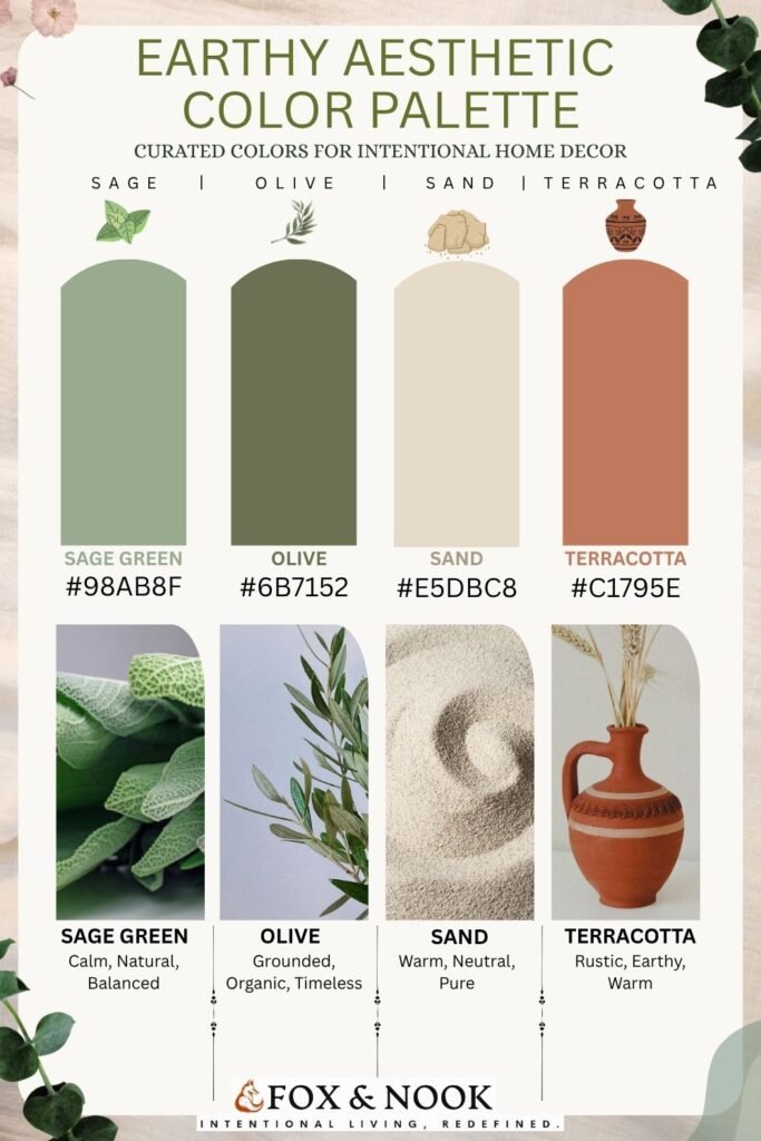
- The Four Colors in This Earthy Palette (With Hex Codes)
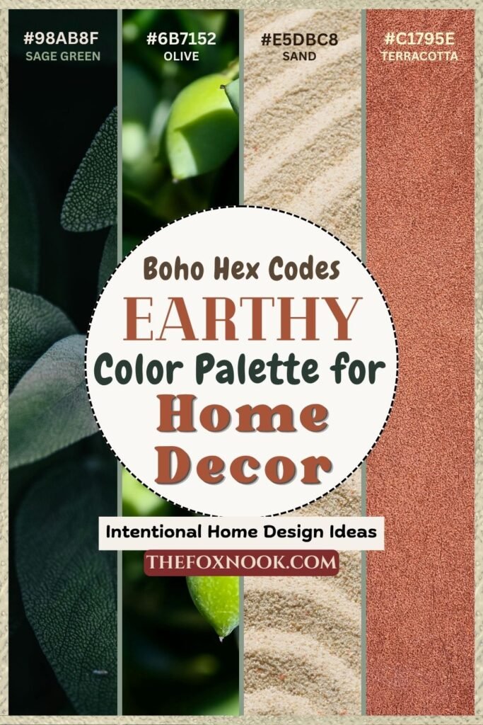
- Sage Green #98AB8F
- Olive #6B7152
- Sand #E5DBC8
- Terracotta #C1795E
- How to Use the Earthy Color Palette in Your Home
- A Note on the Boho and Earthy Color Palette Tone Connection
Earthy Color Palette Introduction
An earthy color palette might be one of the most quietly powerful choices you can make for your home. Warm, grounded, and visually calming, earth tones for home decor have been rising steadily in both interior design conversations and lifestyle spaces online, and for good reason. These are not trend colors in the conventional sense. They are, quite literally, the colors of the natural world, which means they tend to age gracefully and sit comfortably alongside almost any existing furniture or layout.
Our earthy palette scheme has been one of our most saved and shared pieces of content, with several readers asking where to find the actual hex codes and how to start using these tones at home. This post is the answer to that question: honest, practical, and entirely free of the pressure to redecorate everything at once.
Why Earthy Tones Work So Well in a Home Environment
There is a reason that sage green, olive, sand, and terracotta keep appearing in intentional living spaces. Each of these colors carries a psychological warmth that cooler, more saturated palettes often lack. They reflect light softly, they complement natural materials like wood, linen, and clay, and they tend to make a space feel finished without feeling overdone.
Beyond aesthetics, there is growing evidence from environmental psychology that exposure to nature-adjacent colors genuinely reduces stress and improves a sense of ease at home. This is sometimes referred to as biophilic design: the idea that connecting our interiors to the natural world, even through color alone, has a measurable effect on how we feel in a space.
For anyone drawn to slow living or intentional home design, an earthy, warm color palette is not simply a stylistic choice. It is a functional one.
Earthy Color Palette: Sage Green #98AB8F
Character: Calm, Natural, Balanced
Sage green is arguably the most versatile tone in this color palette. It sits in a middle ground between cool and warm, which means it pairs comfortably with almost everything else in the earthy family. In a living room, it reads as restful. In a kitchen, it feels quietly fresh. As a soft furnishing, cushions, throws, and linen curtains, it brings an organic warmth without competing for attention.
It works particularly well alongside natural wood tones and cream or sand-colored walls, and it has become one of the most searched natural color palette shades in interior design over the past two years.
Sage Green Cushion covers selection ↓
Sage Green Linen Throws ↓
Check current prices on Amazon
Our individual picks:
→ 6 Inch Ceramic Plant Pot with Drainage Hole & Tray – Sage Green
Check current price on Amazon
→ Ceramic Pots for Plants Set of 3, 6, 5, 4 Inch Diameter with Drainage Holes
Check current price on Amazon
As an Amazon Associate, Fox & Nook earns from qualifying purchases.
Earthy Color Palette: Olive #6B7152
Character: Grounded, Organic, Timeless
Olive is the deeper, more serious sibling of sage, and it grounds a room in a way that lighter greens simply cannot. It works especially well as an accent wall color, as a piece of furniture’s frame, or in soft furnishings where you want a touch of drama without straying from the natural color palette.
This shade also anchors the boho-adjacent quality of this palette particularly well. The earthy boho color palette trend currently shows a major increase in the intentional home decor preferred color schemes, and olive is one of the tones most commonly associated with that aesthetic.
Our recommendations:
→ HOONEX Storage Bins with Lids for Organizing, Pack of 2
Check current price on Amazon
→ Coffee Mugs Set, 18oz Ceramic Jumbo Mugs Set of 4
Check current price on Amazon
→ Winterdemoon Macrame Wall Hanging Boho Woven Tapestry Home Decor
Check current price on Amazon
As an Amazon Associate, Fox & Nook earns from qualifying purchases.
Earthy Color Palette: Sand #E5DBC8
Character: Warm, Neutral, Pure
Sand is the palette’s quiet anchor. As a background tone on walls, large furniture pieces, or bedding, it allows every other color in this earthy palette to breathe. It is warmer than white and softer than beige, which makes it one of the most liveable neutrals available for a home intentionally designed to prioritize calm over contrast.
The beige and warm color palette trends are also quite a popular choice in the home decor space currently. The Sand tone adds a subtle yet quite distinctive element in home decor, and it is thoroughly aligned with the intentional home aesthetic.
Our recommendations:
→ Hearth & Harbor Bed Sheets, Luxury Soft 6 Piece Bed Sheet Set
Check current price on Amazon
→ 100% Pure Linen Duvet Cover Set 3 Pcs Soft Comforter Cover Sets King Size
Check current price on Amazon
→ Threadmill Luxury 100% Cotton Queen Herringbone Blanket, Sand
Check current price on Amazon
→ Comfy Cubs Muslin Throw Blanket 46” X 68” Sand – Throw Blanket
Check current price on Amazon
As an Amazon Associate, Fox & Nook earns from qualifying purchases.
Earthy Color Palette: Terracotta #C1795E
Terracotta is currently (and has historically been) one of the highest-trending search terms in the home decor space, showing consistent breakout growth on home color palette schemes for intentional home design. It is also the tone in this earthy color palette that carries the most visual warmth and the most character. Used in small doses, terracotta adds a handcrafted, lived-in quality to a space that no cooler or more manufactured colour can easily replicate.
It pairs beautifully with olive and sand, and it is the tone most closely associated with the boho-chic and autumn-inspired home interior aesthetics that are also showing strong trend growth.
Importantly, terracotta works at almost every scale, from a single clay pot to an accent wall, which makes it one of the most accessible entry points into this palette for beginners.
Our recommendations:
→ Terracotta Vase, Large Rustic Ceramic Vase, Farmhouse Decor for Living Room, Shelf, Mantle, Entryway, Room Decor, 9 Inch, Brown
Check current price on Amazon
→ Bigacogo Chunky Knit Throw Blanket for Couch, 40×60 inches, Terracotta
Check current price on Amazon
As an Amazon Associate, Fox & Nook earns from qualifying purchases.
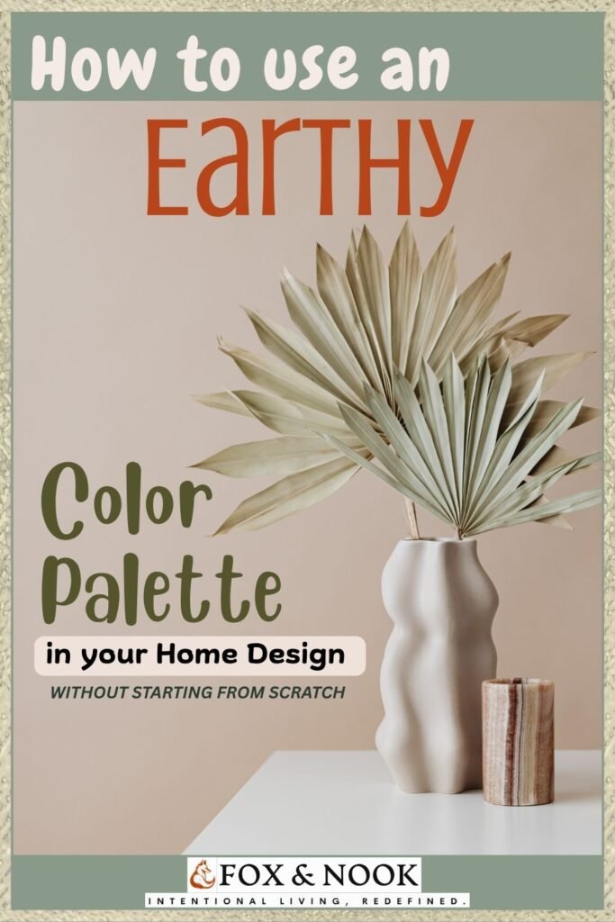
How to Use the Earthy Color Palette In Your Home (Without Starting From Scratch)
One of the most common misconceptions about adopting a color palette is that it requires significant commitment: repainting walls, replacing furniture, starting over.
In practice, the earthy color palette is one of the most forgiving and accessible to introduce gradually, because its tones layer well and complement most existing neutral interiors.
A few approaches worth considering:
Start with soft furnishings. Cushions, throws, and linen napkins are the lowest-commitment way to test how these colors feel in your specific space. They are also easy to switch out if something does not land the way you expected.
Use terracotta in clay and ceramic form first. A single terracotta pot holding a plant you already own is one of the most effective ways to introduce this palette’s warmth without touching a single wall.
Layer textures alongside color. The earthy palette works best when the colors are accompanied by natural materials: wood, wicker, linen, clay, stone. Color and texture together create the grounded, organic quality that makes this aesthetic genuinely calming rather than simply decorative.
Let one shade lead. Rather than introducing all four tones at once, choose the one that resonates most and build from there. Sand as a base, sage as an accent, and terracotta as a single focal point is a combination that works in almost any room.
A Note on the Boho and Earthy Color Palette Tone Connection
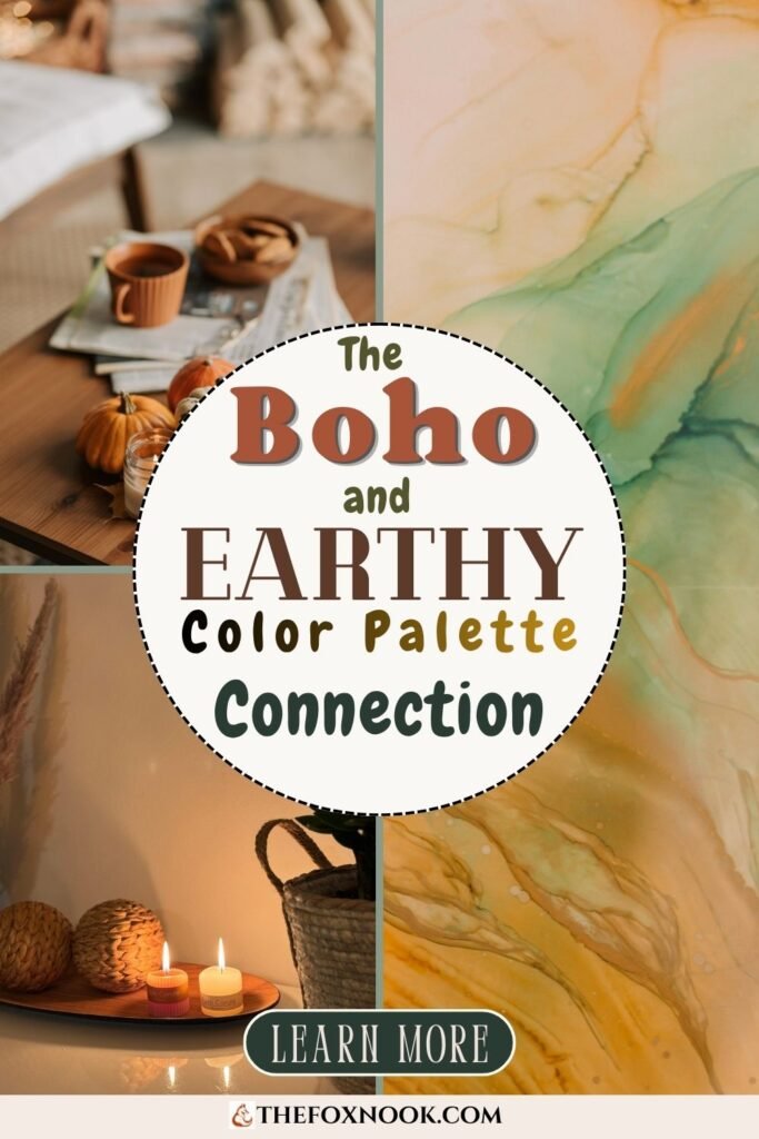
It would be remiss not to acknowledge the overlap between this palette and the earthy boho color palette aesthetic that is currently one of the fastest-growing intentional home decor search trends. The two are closely related; both draw from nature, both favour warmth over coolness, and both prioritise organic texture and handcrafted quality.
The distinction, for the purposes of this guide, is one of intention. The boho aesthetic tends toward eclecticism and layered visual complexity. The intentional home approach favors the same colors and materials, but with more restraint: each item chosen deliberately, each surface allowed to breathe. Both are valid, and naturally, knowing which resonates with you the most is useful before you begin.
Earthy Color Palette Synopsis Table
Guide focus | A practical guide to the earthy color palette of sage, olive, sand, and terracotta, for intentional home decor. |
Who this is for | Anyone wanting to bring more warmth, calm, and natural character into their home without a full redesign. |
Hex codes included | Sage Green #98AB8F · Olive #6B7152 · Sand #E5DBC8 · Terracotta #C1795E |
Intentional Design angles covered | Earth tones, warm palette, boho-adjacent, terracotta, beige/sand, all currently showing breakout or significant growth. |
Core message | Earthy tones are not just aesthetically pleasing; they are a functional, psychologically grounded choice for a calmer home. |
How to start | Soft furnishings, single terracotta pieces, natural textures alongside colour, one leading shade. |
Explore more pillars |
Earthy Color Palette: Final Thoughts
Color has a quieter power in the home than most people initially give it credit for. The right palette does not just make a room look better. It changes how the room feels and, by extension, how you feel within it.
The earthy palette of sage, olive, sand, and terracotta is not merely a trend to chase. It is a considered, nature-rooted foundation for a home that prioritises calm, warmth, and longevity over novelty. That, more than any hex code, is why it keeps appearing in intentional living spaces around the world.
Start small. Layer thoughtfully. And trust that the colors of the natural world rarely get it wrong. ❤️

Thank you for reading our Earthy Color Palette Guide!